Our Logo
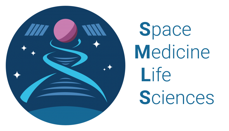
The Space Medicine and Life Sciences project group logo incorporates the DNA double helix, communication, Earth, planets, stars, and satellites.
The double helix works as a bridge between Earth (lower arc) and new frontiers. The new frontier (circle and panels) is shaped so that it could be a spacecraft, satellite, or a new planet. Communication between the frontier and the planet is symbolized by the radio arcs within the double helix which also represents the DNA bridges between the DNA strands.
Overall, the logo symbolises the power of medicine and life sciences’ role in advancing humankind to new frontiers – be it planets, moons, or spacecrafts. Medicine and life sciences work as the bridge between where we are going (frontier) and where we come from (Earth). Bidirectional communication between the frontier and Earth advance humanity as a whole by creating technology and knowledge beneficial for all.
Logo Creator

Antonio Stark
Antonio is a Korea-born space policy consultant and a part-time graphic designer. He represented SGAC in UNCOPUOS, IAC, Space Symposium, UNISPACE+50, and APRSAF. He was also part of the organising teams for SGF 2.0, SGC, and AP-SGW. A consistent nomad, he has lived in San Francisco, Hyderabad, Berlin, London, and is currently residing in Buenos Aires, Argentina.


